 Perimeter and Area: Move from Data, to Graphs, to Functions
In this tutorial, you’ll explore the connections between a circle’s radius, circumference, and area. You’ll collect measurements in a table, plot the data on a graph, and plot functions that fit the data.
Tabulate Measurement Data 
Sketchpad makes it easy to collect measurements in a table and add new data to the table as the measurements change.
Open a new sketch. (If necessary, choose File | New Sketch.)
Construct a circle. With the circle selected, choose Measure | Radius.
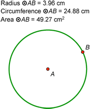
Click in empty space to deselect all objects. Then select the circle and choose Measure | Circumference.
Select the circle and choose Measure | Area.
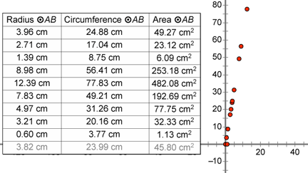
Select the three measurements in order (radius, circumference, and area) and choose Number | Tabulate.
Drag radius point B and observe how the table values update.
Double-click the table. The current values of the three measurements are recorded in the table and a new row appears.
Drag point B and double-click the table again. Repeat this process several more times to add table data for circles of different sizes.
Deselect all objects, then select the table and choose Number | Add Table Data. In the dialog box, choose the second radio button, leave the default to add 10 entries at the rate of one every 1.0 second, and click OK.
Keep dragging point B and observe how new rows are added to the table over a period of 10 seconds.
Plot Table Data
Now you’ll take the data you’ve collected in your table and plot the radius and circumference measurements on a graph.
Select only the table and choose Graph | Plot Table Data. In the dialog box, leave the default settings and click OK. The data from your table appears on a coordinate system.
Drag either the x-axis or y-axis to move the coordinate system until the axes and plotted data do not overlap the circle or table.
Click and drag the bottom right corner of your sketch to make the window larger.
You can also choose Graph | Hide Grid.
Drag any number on an axis tick mark to change the scale. Try to spread out the data points as much as you can while keeping them all visible.
Choose Graph | Grid Form | Rectangular Grid. Now you can change the vertical and horizontal scales independently. Stretch the x-axis so that your plotted points are more spread out.
Choose the Ray tool—press and hold the Segment tool until the straightedge menu appears, move the cursor to the ray icon, and release.
Construct a ray from the origin through any one of the plotted points. What do you notice?
With the ray selected, choose Measure | Slope. Is this value familiar?
Plot a Function to Fit the Data
Now you’ll use Sketchpad’s Calculator to plot a function to fit the data. Your function will relate the radius of a circle to its circumference.
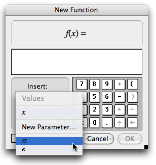
Choose Graph | Plot New Function.
In the Calculator, click the Values pop-up menu and choose π. Then click, in order, the * key, the x key, and OK. A function and its graph appear.
How does the shape of the graph compare with the shape of the data? How could you change the function to make the line fit the data?
Select the function plot and use the Display menu to make the line thicker and a color of your choice.
Double-click the function f(x) = π • x. Multiply the expression in the Calculator by 2 and click OK. What happens? Why?
Double-click the function with the Text tool. Change its label to Circumference and click OK.
Now you’ll repeat this process, plotting a function that relates the radius of a circle to its area, rather than its circumference.
Select the table and choose Graph | Plot Table Data. In the dialog box, click the pop-up menu for y, choose Area ![]() AB, and click OK.
AB, and click OK.
Shrink the y-axis so that all your new data points are in the window. What do you notice about the shape of the data?
Choose Graph | Plot New Function. In the Calculator, click in order the x key, the ^ key (to enter an exponent), the 2 key, and click OK.
How does the shape of the graph compare with the shape of the data? How could you change the function to make the graph fit the data?
Double-click the new function and change it so that the function plot fits the data perfectly. What is your new function?
Double-click the new function with the Text tool, change its label to Area, and click OK.
Explore More
In a new sketch, construct a square (or other regular polygon) and measure its side length and area. Collect the measurement data in a table as you vary its size, then plot the data and plot a function to fit the data.